Help Contents
Overview
Quick Start Guide
Portfolio Lists
Portfolios
Attributes
Prioritization
Optimization
Bubble Charts
Bar Charts
Ranking Charts
Efficient Frontier Charts
Sensitivity Charts
The Bubble Chart Preferences Form
Form Overview
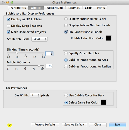
This form is opened by selecting (highlighting) a bubble chart in the Portfolio Bubble Chart List form and then clicking the [Modify] button at the top of the form or clicking on the [Modify] button at the bottom of a displayed Bubble Chart form.
Use this form to customize the appearance and change data attributes of your charts. The form has six tabs for setting different preferences: Parameters, Objects, Background, Grids, and Fonts.
Scroll down or click on the links below to go directly to the tab information:
Parameters Tab:

Chart Name: You can change the bubble chart name in this field. The chart name must be unique to the Portfolio List and not exceed 48 characters, including spaces.
X-Axis: Select the X-axis attribute parameter from this list in this pop-up menu.
Y-Axis: Select the Y-axis attribute parameter from this list in this pop-up menu.
The "Use Weighted Values" Check boxes (Optsee® Plus only): Select a "Use Weighted Value" check box if you want to chart the corresponding individual weighted normalized attribute values instead of the actual attribute values.
X-Axis High: Enter the maximum value for the X-axis value in this field.
X-Axis Low: Enter the minimum value for the X-axis value in this field.
Use X-Axis Default Limits Check Box: When this box is checked, the X-Axis High and X-Axis Low fields are automatically populated with the maximum and minimum values from the selected X-Axis attribute. Furthermore, if the data for the attribute changes such that the maximum or minimum values are changed, these fields are also changed and the Bubble Charts are redrawn with the new maximum and/or minimum values. If this box is unchecked, the Bubble Charts are drawn using the values specified in the X-Axis High and X-Axis Low fields.
Y-Axis High: Enter the maximum value for the X-axis value in this field.
Y-Axis Low: Enter the minimum value for the X-axis value in this field.
Use Y-Axis Default Limits Check Box: When this box is checked, the Y-Axis High and Y-Axis Low fields are automatically populated with the maximum and minimum values from the selected Y-Axis attribute. Furthermore, if the data for the attribute changes such that the maximum or minimum values are changed, these fields are also changed and the Bubble Charts are redrawn with the new maximum and/or minimum values. If this box is unchecked, the Bubble Charts are drawn using the values specified in the Y-Axis High and Y-Axis Low fields.
Note: The X- and Y-axis high and low parameters are not modifiable for attributes with "Short Text" formats.
X and Y Axis Uncertainty Display Options: These checkboxes control the what data is displayed using the uncertainty lines in the bubble charts. The uncertainty lines in the form of bars on top of each bubble. These objects are disabled unless the Uncertainty Tracking is enabled in the Portfolio Preferences. For more details, see Tracking Uncertainty.
Display Maximum-Minimum: The error bars display the maximum and minimum of the selected axis attribute.
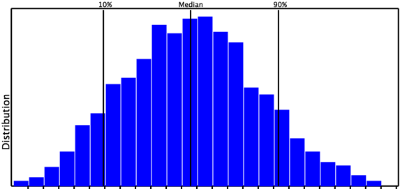
Display 90% and 10% Bars checkbox: This is only enabled if the Median SMART Score is being charted in the respective axis. The error bars display the 90% and 10% limits. The 10% value is where the probabilty of the actual SMART score being less than the 10% value is 10%. The 90% value is where the probabilty of the actual SMART score being greater than the 90% value is 10%. Therefore, there is an 80% probability that the actual SMART score is between the 10% and 90% values.
Histogram illustrating the 90% and 10% Probability Points: There is an 80% probability that the actual values is between the 10% and 90% lines.
Display Std. Deviation Bars checkbox: This is only enabled if the Mean SMART Score is being charted in the respective axis. When this box is checked, the error bars display the number of standard deviations selected in the "No. of Sigmas" popup menu.
No. of Sigmas popup menu: This is only enabled if the Mean SMART Score is being charted in the respective axis and the "Display Std. Deviation Bars" checkbox is checked. When this box is checked, the error bars display the number of standard deviations selected in the "No. of Sigmas" popup menu.
Histogram illustrating the Mean and Standard Deviation Points: There is a 68.2% probability that the actual values is between the +1 and -1 sigma values, a 95.4% probability that the actual values is between the +2 and -2 sigma values, and a 99.6% probability that the actual values is between the +3 and -3 sigma values.

The bars in bubble charts and Project Ranking charts are illustrate as shown here:

[Mark Unselected Projects] check box: This displays an "X" across any project bubbles that are not selected in the Portfolio form or Project form. Projects are selected and deselected by clicking in the far left column of the Portfolio form or checking the "Selected" check box in the Project form.
Objects Tab:
Bubble Display Preferences:
[Display as 3D Bubbles] checkbox: When this checkbox is selected, bubbles are displayed with a 3D spherical look.
Bubble Scale pop-up menu: This allows you to uniformly shrink or expand the size of all of the bubbles from 20% to 200% of their default size.
[Display Bubble Numbers] check box: This displays numbers in the center of the bubbles corresponding to numbers next to the item in the legend. This is useful when you have bubbles with similar or same colors.
[Display Bubble Names] check box: This displays the name of the bubble in the center of the bubbles corresponding to the name in the legend. Note that bubble names will overlap in crowded charts.
[Use Smart Bubble Labels] check box: This helps prevent overlapping bubble names. When checked, bubble names remain aligned horizontally with the associated bubble but are moved up or down vertically to avoid overlap. Bubble names for bubbles with centers that exactly overlap are displayed from top to bottom largest corresponding to the largest to smallest bubble.

[Mark Unselected Projects] check box: This displays an "X" across any project bubbles that are not selected in the Portfolio form or Project form. Projects are selected and deselected by clicking in the far left column of the Portfolio form or checking the "Selected" check box in the Project form.
[Display Drop Shadows] check box: This displays bubbles with drop shadows to give a more 3-D appearance. Note that using drop shadows interferes with transparency because the shadows are not transparent.
[Bubble Label Font Color] selection: Click this square to open the system Color Picker form to select the color for the fonts of the number and/or name labels displayed on the chart (if selected).
[Order Legend by Value] check box (Optsee® only): Use this check box to select how the projects in the legend are ordered. When checked, the projects are ordered by their overall value ranking in the portfolio; otherwise, they are ordered alphanumerically. The default value is unchecked (order alphabetically).
[Bubble % Opacity] slider and field: You can adjust the bubble transparency by using the % Opacity slider or entering the value directly in the field. "100%" is nor transparency and "0%" is completely transparent (invisible). Note that best transparency effects are obtained using a light background and drop shadows are turned off.
[Blinking Time (seconds)] slider and field: You can adjust the bubble blinking time by setting the Blinking Time Slider. Higher blink times indicate longer intervals between blinks.
Bubble Proportionality Preferences:
[Equally-Sized Bubbles] radio button: When this box is checked all of the bubbles are drawn to the same size, essentially turning the chart into a scatter chart. You may find this quite useful in visualizing the relationship of the projects in the X-Y plane.
[Bubbles Proportional to Area] radio button: Select this radio button to set the bubble area to be proportional to the values assigned to the bubble size. This is a straight-line linear relationship between the value and the area of the bubble, so the bubble area will increase in direct proportion to the assigned values. [Bubbles Proportional to Area] is the default value for this preference.
[Bubbles Proportional to Radius] radio button: Select this radio button to set the bubble radius to be proportional to the values assigned to the bubble size. This is a curved-line relationship between the values and the area of the bubble. Since Area=πr2, the area of the bubbles will increase proportionally faster than the assigned values. This can be useful when illustrating charts in which you want to magnify the differences in the bubble sizes.
Uncertainty Bar Preferences:
[Use Bubble Colors For Bars] radio button: When this radio box is checked the uncertainty bars are drawn with the same color as the bubble.
[Select Same Bar Color] radio button: When this radio box is checked the uncertainty bars are drawn with the color selected using the color-picker button to the right of this button.
Bar Width popup menu: This allows you to select the width (thickness) of the uncertainty bars.
Background Tab:

Color and Background Preferences:
[Background Color] selection: Click this square to open the system Color Picker form to select the background color for the chart.
[Foreground Color] selection: Click this square to open the system Color Picker form to select the foreground color for the chart. This color is used for the chart text and axes.
Gridline color pop-up menu: Use this menu to select the grid line colors. Gridlines can be black, grey, light grey, white or match the selected foreground color.
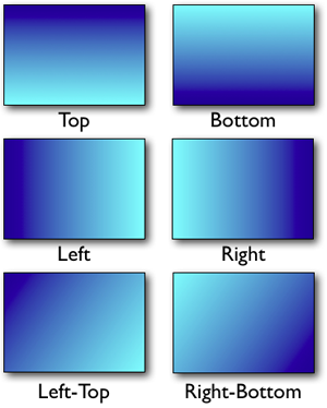
Gradient Type pop-up menu: Use this menu to select the type of gradient that you want in the background. "None" displays the background as a solid color corresponding to the selected Background Color. Selecting the other options draws a gradient in the background beginning with the background color and transitioning to the gradient color. The figure below displays example gradients corresponding to different menu selections. The gradients shown start with a dark-blue background color and transitioning to a light-blue gradient color.
[Gradient Color] selection: Click this square to open the system Color Picker form to select the second color for the gradient. The first color is the background color. The background color will transition to the gradient color.
Background Picture:
[Use Picture in Chart] check box: Check this box to have the selected picture display in the background of the bubble chart area.
[Use Picture in Legend] check box: Check this box to have the selected picture display in the background of the bubble chart legend area.
[Picture Fill] slider: Use this slider to lighten or darken the selected picture image. Sliding to the left lightens the image and sliding to the right darken the image.
[Picture Fill] field: Use this field to lighten or darken the selected picture image. Values 0 to 99 lighten the image and values 101 - 200 darken the image.
Thumbnail Preview: This displays a thumbnail of the picture selected as the background picture.
[Select Picture] button: Click this button to open the Background Picture Selection form to select or import a new background picture.
Legends Tab:

Legend Display Preferences:
Legend Location pop-up menu: This allows you to set the location of the legend area in the bubble chart form.
[Hide Legend] check box: Check this button to hide the legend area in the bubble chart form.
[Display in Chart Area] check box: Check this button to display the legend in the chart area on the bubble chart form. When unchecked, the legend is displayed in a separate area on the bubble chart form.
Legend Borderline pop-up menu: This allows you to select a borderline style for the legend area in the bubble chart form.
Legends to Display:
These buttons are enabled when a custom menu has been selected in the custom legend listbox.
[Bubble Legend Only] radio button: Click this button to only display the bubble legend in the legend area on the bubble chart form.
[Custom Legend Only] radio button: Click this button to only display the selected custom legend in the legend area on the bubble chart form.
[Bubble and Custom] radio button: Click this button to only display both the bubble legend and the custom legend in the legend area on the bubble chart form.
Custom Legends let you create your own color and/or pattern combinations to identify groups of projects in your charts. For example, individual projects could be identified by their assigned colors and then groups of projects could be identified by their assigned pattern.
Once created, a custom menu is available to all charts from the preference form. To select a custom menu to display in your chart, click the left column of the row listing the chart. A check mark will appear in the column next to the selected legend. To unselect a chart, click on the check mark next to it or select a different chart.
[New] button: Click on this button to open the Custom Legend Name form to create a new custom legend.
[Open] button: Click on this button to open and edit the selected (highlighted) custom legend in the Custom Legend form. This button is enabled only when a legend item in the list has been selected.
[Duplicate] button: This button opens the Custom Legend Name form to let you name and save an exact duplicate of the custom legend selected in the list.
[Delete] button: Click on this button to delete the selected custom legend. You will be prompted to confirm that you want to delete the selected legend. This button is enabled only when a custom legend in the list has been selected.
Grids Tab:

[Hide Axis] radio buttons: Check these buttons to hide the corresponding axis. This will only be visible if the [Display Chart Borders] check box is not checked. If axes' ticks and labels, if visible, will be displayed along the chart borders.
[Display X-Axis on Bottom] check box: This will display the X-axis along the bottom of the chart.
[Display Y-Axis on Left Side] check box: This will display the Y-axis along the left side of the chart
[Display X-Axis in Center] check box: This will display the X-axis horizontally in the vertical center of the chart.
[Display Y-Axis in Center] check box: This will display the Y-axis vertically in the horizontal center of the chart.
[Show Axis Ticks] check boxes: Select these check boxes to toggle the display of the axis' ticks. Checking these boxes causes the X- or Y-axis ticks to be displayed. Un-checking these boxes will also cause the Show X-Axis Tick Labels and Show Y-Axis Tick Labels to become unchecked; however, these can be re-checked if you want to display the ticks without the labels. The default condition for both of these preferences is checked.
[Show Axis Tick Labels] check boxes: Select these check boxes to toggle the display of the respective axis’ tick labels. Checking these boxes causes the X- or Y-axis tick labels to be displayed. It will also cause the Show X-Axis Ticks and Show Y-Axis Ticks check boxes to become checked because the axis tick labels cannot be displayed without the axis ticks. The default condition for both these preferences is checked.
[Show Axis grid lines] check boxes: Select these check boxes to toggle the display of the axis’ grid lines. Checking these boxes causes the X- or Y-axis grid lines to be displayed. The default condition for both of these preferences is checked.
[Number of Axis Ticks] check boxes: Use these pop-up menus to select the number of ticks and/or grid lines, up to 20, to be displayed. The default value for both these preferences is five.
[Axis Significant Figures] check boxes: Use these pop-up menus to select the number of decimal point figures to be displayed. You can select up to seven significant figures to be displayed. The default value for both of these preferences is one.
[Use Assigned Formats in Tick Labels] check box: Select this box to include the formatting assigned to the attribute column in the Attribute form in the tick labels.
[Hide Chart Title] check box: Check this box to hide the chart title.
[Display Chart Borders] check box: Select this box to display the chart borders and grid lines. Note that the chart grid lines cannot be displayed without the borders.
[Display Chart Corners] check box: Select this box to display the only the corners of the chart area borders. Note that the chart grid lines cannot be displayed with chart corners displayed.
Fonts Tab:

The Font Preferences is the last tabbed page of the Chart Preferences form. It allows you to control the size, type and style (plain, bold, or italic) of the chart fonts. Use the Size pop-up menus to set the font size and the Type pop-up menus to set the font type. Check the [Bold and/or Italic] check boxes for bold and/or italic font styles, respectively.
Chart Preference Form Buttons:
[Save]: Click on this button to save any changes made to the Chart Preferences, close the form, and redraw the chart.
[Cancel]: Click on this button to close the Chart Preferences form. No changes will be saved.
[Save As Default]: Click on this button to save your current settings as the Chart Preference Default Values. All new charts will then use these settings.
[Restore Defaults]: Click on this button to restore all of the last saved Chart Preference Default Values to the current form.